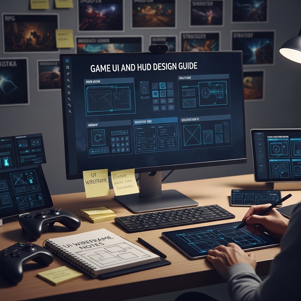

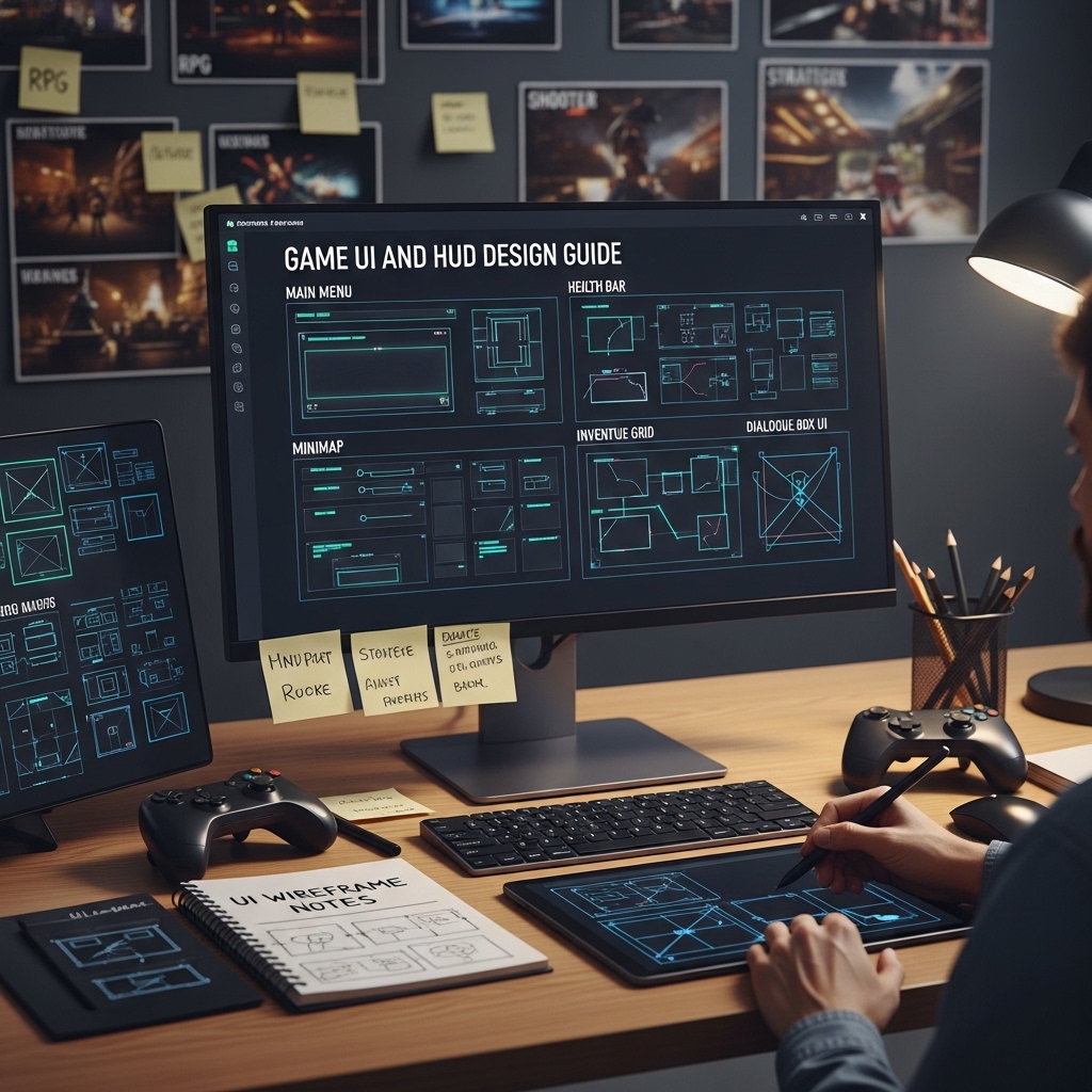
Game UI and HUD Design Guide
The Visual Design, Information Architecture, and Player Communication Principles for Game Interface Design
The best game UI is the UI the player never thinks about.
Not because it is invisible — because it is so well-suited to the game’s visual language and so clearly communicating exactly the information the player needs at exactly the moment they need it that it requires no conscious effort to read. It is simply there, like a well-placed traffic sign: absorbed without being noticed.
The worst game UI is noticed constantly. The health bar that is the same red as the enemy projectiles. The inventory that requires four clicks to swap an item during combat. The objective marker that appears on top of the enemy during a cinematic. The minimap that shows everything except the thing the player is currently looking for. The font that is readable on a 4K monitor and illegible on a 1080p TV from the couch.
The gap between those two experiences is almost entirely design decisions. And design decisions can be learned.
This guide covers the principles, the patterns, and the practical implementation considerations that produce UI players never complain about. 🎨
PART ONE: THE FOUNDATION PRINCIPLES
Information Hierarchy in Game UI
The first principle: every element in the HUD is competing for the player’s attention, and the player’s attention is a finite resource that is primarily needed for the game, not the interface. The hierarchy framework ranks every HUD element by criticality: the information that affects whether the player lives or dies in the next five seconds (health, ammo, danger indicators) sits at the top of the hierarchy and receives the most prominent, most immediately readable treatment. Information consulted occasionally (maps, inventory counts, objective lists) sits lower and can afford to require a brief, intentional glance. Information that is contextual (interaction prompts, tutorial hints) appears only when relevant.
The practical layout implication: the primary information lives in the player’s natural gaze path (typically the center and lower-center of the screen for action games, the upper corners for strategy games), secondary information lives at the edges, and contextual information appears in the world rather than as HUD overlay where the game’s visual context allows it. 📐
The Diegetic vs Non-Diegetic vs Spatial UI Spectrum
The four UI types and the design considerations for each:
Diegetic UI — Interface elements that exist within the game world and are visible to the character: the watch on the character’s wrist that shows time, the armor condition visible on the character model, the health pack count on the character’s belt. The most immersive option; the most constrained by art production and legibility requirements.
Non-diegetic UI — The traditional overlay HUD: health bars, minimaps, ammo counters. The most flexible; the most at risk of feeling disconnected from the game world.
Spatial UI — Interface elements that exist in the game world but are not visible to the character: the floating health bar above an enemy’s head, the waypoint marker in 3D space. The compromise between immersion and clarity.
Meta UI — Interface elements that exist outside the game world’s reality but reference it: the blood-on-screen health indicator, the screen vignette that signals damage. The approach that communicates information through the game’s visual style rather than through traditional UI conventions.
The design guide for each type: when it fits, when it does not, and how to combine types without producing an inconsistent visual language.
PART TWO: THE HUD DESIGN SYSTEM
Health, Stamina, and Resource Display Patterns
The fourteen most common approaches to communicating player health, with the appropriate use case for each: the numeric display, the segmented bar, the continuous bar, the armor-over-health layered display, the heart container system, the percentage display, the “danger state” minimalism (full health shows nothing; low health shows an indicator), the color-coded zone system (green/yellow/red), the character model damage display, the persistent screen edge vignette, the sound-only approach, the world-space character indicator, the HUD element that pulses or animates on damage, and the hybrid systems.
For each: the readability characteristics (how quickly can a player register their current state under pressure), the visual noise implications (how much screen real estate and visual complexity the display requires), and the genre contexts where it performs best. 💚
Minimap Design Principles
The minimap that helps versus the minimap that distracts: the information density decision (everything on the map versus only the immediately relevant information), the scale and zoom level calibration, the orientation conventions (north-up versus heading-up versus the decision to omit orientation and rely on distinctive landmarks), the icon design for enemies, objectives, allies, and points of interest (the legibility at minimap scale, the color conventions that work with and against colorblindness), and the dynamic minimap that reveals rather than exposes.
The toggle versus persistent versus proximity-revealed minimap design — the three approaches and the player experience implications of each.
Inventory and Equipment UI Patterns
The inventory design decisions that determine whether managing equipment feels like game design or administrative churn: the grid inventory versus the list inventory versus the equipment slot visual, the item information density (the item tooltip that tells the player everything they need to know without requiring a second screen of information), the comparison UI for upgrade decisions, and the inventory interaction design for controller versus keyboard-and-mouse input.
The time-stop versus paused versus real-time inventory access decision — the player experience implications of each and the design constraints each places on the inventory UI layout. 🎒
PART THREE: MENU AND SCREEN DESIGN
Main Menu Design
The first impression and the return home: the main menu that communicates the game’s tone in the time between the player seeing the title screen and pressing start. The background animation decisions, the menu option hierarchy, the new game versus continue versus load game state management, and the settings and accessibility option placement.
The settings menu completeness standard: the minimum viable settings for PC releases (resolution, display mode, target framerate, master volume plus independent music/SFX/voice channels, and at minimum colorblind mode, subtitle toggle, and text size adjustment), the recommended additional settings for accessibility-forward games, and the settings change preview approach for visual settings.
Loading Screen Design
The loading screen that works for the game rather than against it: the tip and lore display strategy (the information worth showing versus the filler content that players ignore after the second time they see it), the loading bar versus spinner versus neither, and the interactive loading screen for games where the load time is significant.
Death and Game Over Screen Design
The screen that appears more than any other in games with significant difficulty. The tone calibration — from the brutal and punishing visual language of roguelikes through the neutral and informational through the encouraging and character-voiced — and the design implications of each. The retry friction analysis: how many inputs does the player need to make to be back in the game, and what is the right number for this game’s difficulty contract with the player? 💀
PART FOUR: ACCESSIBILITY STANDARDS
The Accessibility Checklist for Game UI
The UI accessibility standards that have moved from “nice to have” to expected by a significant portion of the player base: the colorblind modes (the three types of colorblindness and the specific UI color decisions that fail each one, with the safe palette alternatives), the text size scaling, the subtitle design (the background contrast requirement, the speaker identification, the sound effect description standard for d/Deaf players), the high contrast mode, the UI element scale adjustment, the motion sensitivity options for animated UI elements, and the input remapping implications for UI navigation. ♿
📂 COMPLETE FILE LIST
🎨 Complete design guide PDF (A4 and US Letter, extensively illustrated) | 📐 HUD layout templates for common game genres — action, RPG, strategy, platformer (editable, Figma + PDF) | ✅ UI accessibility checklist (editable) | 💡 Color palette guide — colorblind-safe UI color systems (PDF + Figma swatches) | 📊 Information hierarchy worksheet for custom HUD design (editable) | 🖼️ Icon design principles reference for game UI (PDF)
Reviews
There are no reviews yet.